 Viewing your heart rate, pace zone and power zone distributions (i.e. how much time spent in each zone) along with Suffer Scores for individual activities is very straightforward, but only once we see that data represented over longer periods of time do we get a clearer view of how well our training has been going. On your VeloViewer Summary page each of these metrics can now be viewed with the distributions clearly displayed with the data grouped over whichever time period you need.
Note: The power brackets, heart rate zones, pace zones and suffer scores are only calculated by Strava and provided via their API for users who have a Strava Premium membership. If you’re not yet seeing all of this data in your Summary screen then please see #11 on the FAQ.
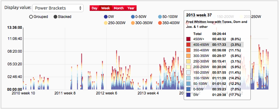
Power brackets for the last 5 years’ worth of activities grouped by week with tooltip shown.
On your Summary page you will find the history histogram showing all of your Strava history with columns representing your the distance covered, elevation climbed etc. for all of your activities. These can be grouped by day, week, month or year to provide an easy view of your progress. The heart rate zones, pace zones, power brackets and Suffer Scores are also available in the “Display value” selection box and offer much more value than just a single figure per timespan so these can now be represented as stacked and grouped columns in a single view.
Power Brackets
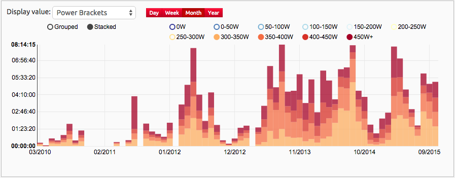
The power brackets provided by Strava’s API are broken up into 50W chunks up to 450W and then a single bracket to catch all time spent above 450W. By default these values exclude estimated power (only if you have at least 1 activity with real power data, which includes Zwift) but there is an “include estimated” checkbox which can be selected.
Power brackets grouped by month but with the lower power brackets filtered out using the toggles at the top. My FTP is a little over 300W so this is roughly showing me how much time was spent above my FTP over the last 5 years.
On each of these views you can click the values in the legend at the top to turn each bracket/zone off and on.
Top tip: Double click a value in the legend to filter out all other brackets/zones. Then turn on others as required. Click a single, selected legend value to reselect all.
Heart Rate Zones
The ranges used for heart rate zones are specific to every activity and are based on the max heart rate that was set at the time of the activity, for that reason the actual beats per minute values aren’t shown, just the zones themselves.
Viewed in the “Grouped” mode (rather than “Stacked”) with the heart rate zone data grouped by year. Less than an hour in hour spent in Zone 5 this year = must try harder!
Suffer Scores
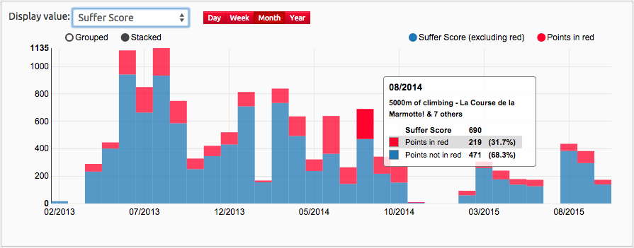
Strava’s Suffer Score is based on the amount of time spent in each heart rate zone with a “Points in red” showing the amount of time in zones 4 & 5. The more red you see, the more you like to hurt yourself!
Top Tip: Click on any column in these charts to navigate to either the Activities List page (if more than one activity represented by the column) or the Activity Details page (if just a single activity for that time period).
If nothing else these views have motivated me to wear my heart rate monitor for every activity just to see if my willingness to suffer has actually left me or whether I’m able to redress that balance and make 2016 the year of the suffering.
Pace Zones
After a request over on the VeloViewer Run Club discussion board on Strava I discovered that the pace zones shown to Premium users on run activities on Strava is also available via their API so I’m now pulling those in to be viewed in the same way:
Update (4th Nov 2015)
For people with at least some activities with Power Meter (includes things like Zwift) then when viewing power data in these charts or the calendar view then the default view will exclude estimated power activities. A checkbox is provided to include estimated power.
The heart rate and power zones can now be viewed as a percentage:
Update (13th Nov 2015)
Pace Zones added in to the mix.


Paul says:
Love the summary graphs, but I noticed that when I hover over a bar, the activity dates seem to be off by one day. For example, rides that I did on a Sat. 8/8 show up on the graph as Friday, 8/7. Is there a setting I need to change to correct that?
Ben says:
Can you email me a link to your Summary page Paul? I’ve checked mine and it is showing the correct dates but it could well be a timezone issue.
Torsten says:
Great stuff! I wonder why there are entire (mostly summer) months simply missing in the heart rate and power bracket views? They are there in the distance etc. views. And they are all with measured heart rate and power data – so no idea why I have such huge gaps in the history when having these values as display values.
Ben says:
You’ll just need to head to your Update page and press the “Check for new segments” button until you have gone through all of your activities to fetch this new data.
Torsten says:
took a few days – but now it seems it’s all there. 🙂
vincent says:
Love veloviewer and specialy summary page.
But, i frequently analyse a period (ex : 3 month before race – race or for another example, last 12 month) and i don’t find the option to do this in veloviewer. Is it possible ?
Thanks for your answer