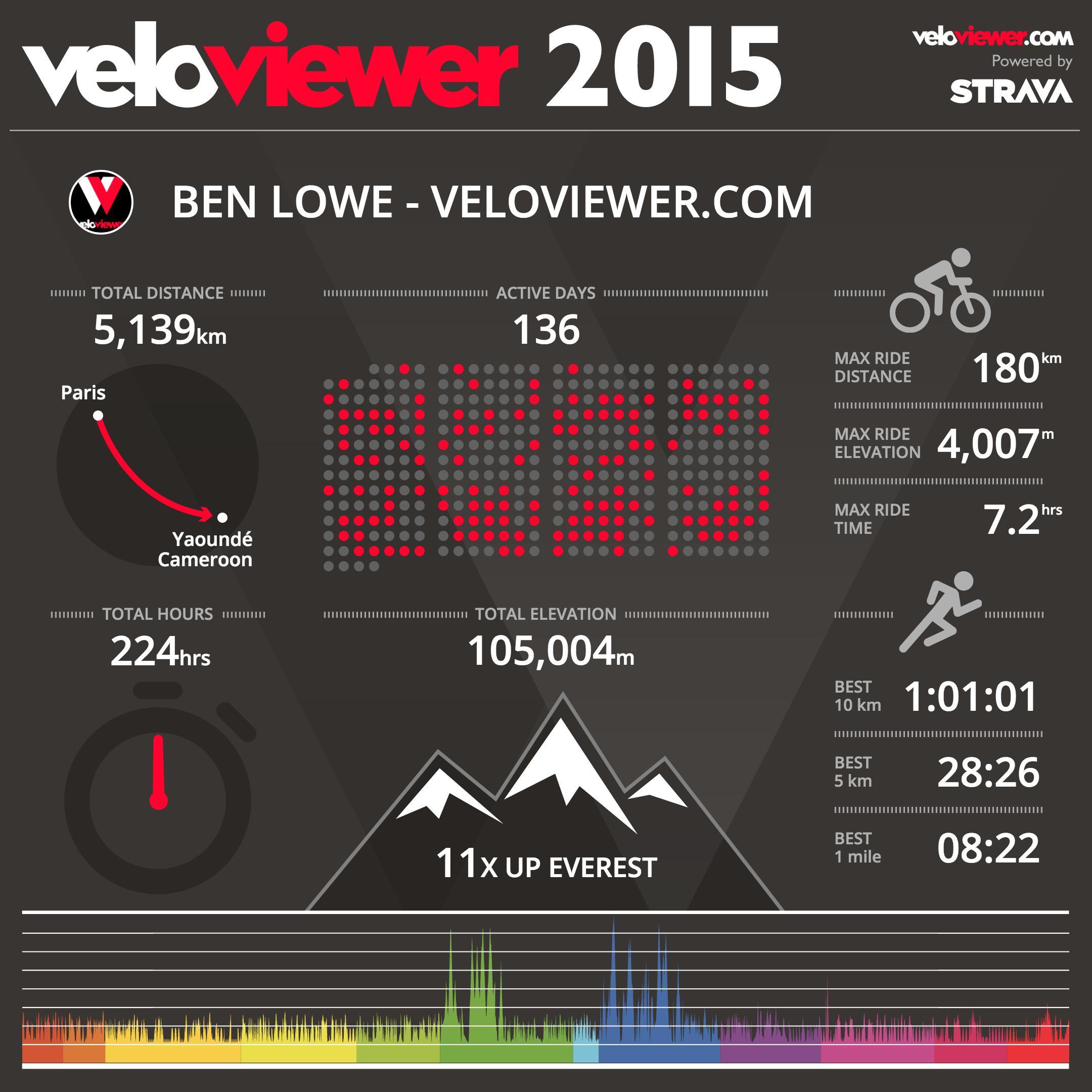
 It is that time of the year when we can bask in the glory of our own epicness with (hopefully) huge distances explored, mountains conquered and PBs smashed making all of the saddle sores and blisters worthwhile. Or perhaps a year of simply commuting to work or Park Runs with most likely more impressive results than my own! Whatever your achievements this year VeloViewer has stepped up to provide you with a funky infographic that hopefully you’ll all share far and wide showing everyone what you’ve been up to.
Read enough already? Then head straight over to view and share your own VeloViewer 2015 Infographic!
Please do tag @veloviewer on your Facebook/Twitter/Instagram posts so I can also see your achievements.
You don’t even have to be a PRO user to get your infographic. Anyone can connect their Strava account and view their image although PRO users will get to see their year’s elevation profile at the bottom along with their best running times.
Have a Merry Christmas and a happy, and obviously even more epic, new year! Ben.

Mental note… attempt to improve my run times before the new year!
Alexandre Monteiro says:
Please include the swim workouts!
Ben says:
All activity types are included in the figures unless you restrict to just Rides or Runs. Too tricky this time round to cope with Rides, Runs and/or Swims. Tricky enough dealing with people that only Run or Ride.
Mark gibson says:
Mine doesn’t show up on ipad? But strangely does on iphone?
Mark gibson says:
I’m on pro+ too wonder if that’s makes difference?
Paul says:
Free 2015 graphic worked so upgraded to Pro+ now only getting part of my year???
Ben says:
Make sure you head to your Update page and sync all of your data after upgrading.
Dominic Watts says:
That’s fantastic Ben. I’ll wait until the year is finally over before I post my infographic.
Steve Higgins says:
Doesn’t work for me I get the message ‘Save the image below to your device and get sharing! Make sure to tag @veloviewer when sharing so I can see your 2015 :-)’ But no Image?
Ben says:
I’ve made a few changes. Let me know if it has fixed it.
Tim says:
Nice graphic, thanks. I can’t work out what the graph at the bottom is – mine is divided into two colours, and the peak lines (i.e. the highest points) don’t seem to coincide with my hunch as to when I rode the longest/gained the most elevation on a ride. I see that your graphic on this page has lots of colour dividers – can you explain what they are? thanks
Tim says:
Have played a bit more with this. It looks as though it didn’t fully load. At the moment it is hanging and not loading properly, probably because lots of others are doing the same as me. I’ll wait a bit and then try again.
Ben says:
Make sure that all of your data is up-to-date via the Update page. The graph should be your elevation profile for your full year coloured by month.
Potentially it could be that the API limit is being reached. I’ll have a look to add a message in if that happens. Let me have a link to your page if you’re still having trouble and I’ll take a look.
Tim says:
Ben, yes, its uploaded the whole year with the differerntly coloured months now. But it doesn’t seem to be working quite right? The graphic shows that my big climbs were all in the same colour band/month, but I did big climbs (9k feet and more) in three different months, which all show up fine on the regular summary page at http://veloviewer.com/athlete/71754/summary
Ben Lowe says:
It looks ok to me Tim. Because it is drawn to scale and you’ve got the Stelvio in there is will make all the UK rides look pretty darn flat. If you check out your Wheel and set the start end dates to be the full year then you’ll see the same thing. I can go and wrack up 4000m of climbing in The Peak but it’ll just look like a small wiggly line compared to the summer hols we had in the Alps.
Tim says:
Ben, thanks for that. Ultimately, it doesn’t matter as it is just a picture, but I’m still not sure I agree. In June, as you say I rode the Granfondo Stelvio, total climbing 14k feet. In May, I did four rides of more than 7k elevation. And in July, one ride of 10k elevation. But when I look at my infographic, all the big rides are in the same month, coloured light green (and actually, I can only see 11 different coloured months) .As I say, it doesn’t matter that much, as it’s the riding that counts to me, but I thought you’d like to know it still doesn’t seem quite right in the infographic.
Hybrid Noob says:
Perfect timing and great graphic! I’ve just decided to hang up the wheels to have a rest until the new year and also to fully concentrate all my energies into eating.
Neil says:
Not working correctly for me as saying onli 111 activities and i have 123 in my list. The max ride details are incorrect because of this I think.
Ben says:
Can you give me a link to your page (which will include your Strava number) so I can take a look?
timojhen says:
Really cool. Any thoughts to allowing us to do prior years? (Maybe later?). Think it’d be interesting to have the last couple of years in the same format. Already know how I’d like to see my 2016 version change! 🙂
Peter says:
This is cool! I like it better than the Strava thing last year with the sappy music. 😉 One question: I assume this isn’t a one-time thing right? E.g. I can generate the infographic at will? I ask because Strava’s year in review thing in 2014 was a one-shot deal, and I did mine before I was finished riding for the year and got ripped off. 🙂 🙂 🙂
Tom says:
Hi Ben,
Love the site and all the data.
Sadly I get an Error 2 on the 2105 Graphic. Can you help at all? Maybe I have a dodgy activity?
http://veloviewer.com/athlete/1046982/summary
Thanks
Tom.
John Branum says:
Mine still isn’t right. I updated it and its still showing a total of 2964 miles when it should be 3000. http://veloviewer.com/athlete/1184138/summary
Geoff says:
Great work Ben !
kevin mack says:
Hi, I have tried on 3 different computers now, but it won’t let me save my image to use. Right click, “save as” menus do not appear. Please can you advise?
Thanks in advance
Dave says:
Any chance to get a year selector on the graphic? So those that have only recently joined could have a graphic for each year… I’d love to be able to compare my progress for each year.
Cheers,
Stefan says:
Great work Ben,
the only Thing, the “Get your local town/city” don’t work for me, my Hometown is listed only onetime a year and 99% not. Is it possible to fix it User = hometown?
Ben Lowe says:
I use an external API to get towns based on your browser’s reported position so there is a chance it won’t include every town. It also depends on what location your browser is reporting. Is it showing locations close to where you are or are the towns a long way away? Where are you based?