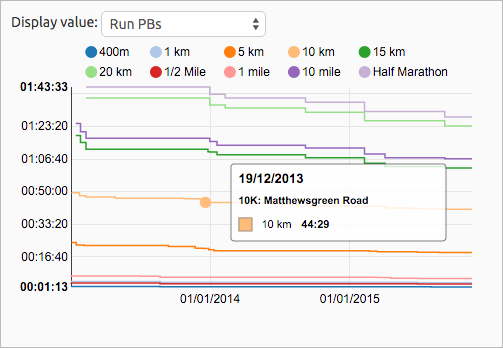
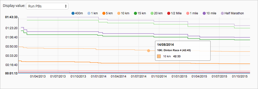
 A user recently requested on the VeloViewer Run club in Strava to be able to see an evolution of their running best times over the years, so here it is. With the filtering already available on your Summary page you can also just select a single year to easily view your season bests for each distance too.
Simply scroll down to the History chart on your Summary page and select “Run PBs” and the chart will show a line for each distance you’ve covered (from 400m up to marathon & 50k) with a data point for each new personal best:
Hovering over each point will show the name of run for that PB and clicking on the point will open the run’s Activity Details page.
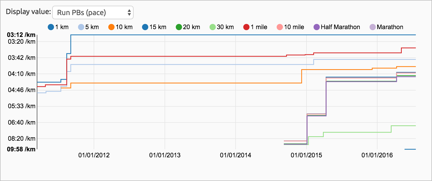
Update (18th July 2016) – You now also have the option to view these Run PBs by pace rather than time:
Season Bests
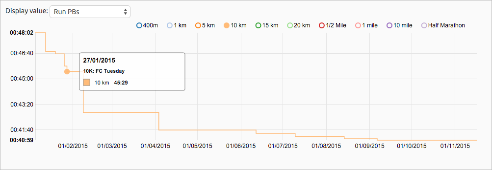
Select a year in the filters at the top of the page and this chart (along with all other charts on the page) will be filtered to just that year’s runs. PBs from previous years are ignored to just show the best times for that season:
Top Tip: As with all of the charts on VeloViewer that have multiple data series being displayed you can turn each data series on or off by clicking on the appropriate item in the chart’s legend. To quickly see a single series’ data (e.g. just the 10k Season Bests shown in the image above) then double click the appropriate legend item.
Also of interest
Check out the recently add summary of heartrate and pace zones that are shown in the same chart:


Paul Mackenzie says:
Really nice. Thanks for implementing.
Ben says:
No worries. Thanks for letting my use your data for the testing/screenshots.
Arnet says:
The link doesn’t work you forget the .com http://veloviewer.com/summary
Ben says:
Thanks. Fixed.
Steve Mayne says:
Hi Ben – thanks for this; great work! Minor bug; when you resize the browser window the checkboxes for distances reset themselves.
Ben says:
Thanks Steve. Should be fixed now.
Nick B says:
Just found your website after spending time mucking around with .gpx files to work out my own stats – tempted not to bother anymore and shell out for this as you’ve already done most of the stuff I want to do!
This is awesome but just a thought – it would be cool to be able to choose to have pace on the y-axis instead of overall time for easier comparison between distances 🙂
Ben Lowe says:
Hi Nick. I’ve added in a “Run PBs (Pace)” option onto that chart.
Nick B says:
So awesome! I was happy to sign up to pro today and check it out and realise you’d already incorporated my idle thought two days after I mentioned it!
Stephen Dawson says:
The “Hovering over each point will show the name of run for that PB and clicking on the point will open the run’s Activity Details page” bit doesn’t work for me using Pale Moon as browser (v26.3.3 in Windows 7), but is fine in Chrome and Internet Explorer.
Indeed, the hovering doesn’t seem to work whatever parameter I select in this graph, but it works fine in the other graphs (and tables) on the Summary page.
Ben Lowe says:
Hi Stephen. Does it give you any Javascript errors at all when you experience this issue? Email me the errors and any screenshots if you see some.
Todd Hepworth says:
Hi Ben,
New user. Fantastic site :D. Signed up for PRO pretty much immediately. I’ve got the PBs by Time and see my various graphs, but hovering over does nothing. This is in both Chrome and Edge. Still fantastic site 😀
Ben Lowe says:
Sorry for the huge delay in replying! (I don’t check the blog comments very often). Can you email me a link to your Summary page so I can take a look if it is still an issue for you.